“Build what British people want,” housing minister Kit Malthouse exhorted architects at a recent conference to discuss his department’s Building Better, Building Beautiful Commission, chaired by the right-wing philosopher Sir Roger Scruton. Malthouse believes that if the views of the British people are taken more into account by designers, then new development will meet less resistance from local communities. By selecting Scruton, a devotee of classical and vernacular architecture, Malthouse assumes that the British public is only interested in the styles of the past.
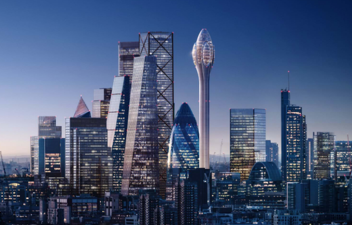
What better barometer of Middle England taste could Malthouse have than the presenters of the BBC’s Breakfast programme? When Foster and Partners recently launched their decidedly space-age designs for an observation tower in the City of London, branded The Tulip, anchor Dan Walker called the proposed structure “a good looking building”. His co-presenter Naga Munchetty agreed, but went further. She commended the tower because it was “very space-like” and then used the “B” word on live television. She called the Foster & Partners design “Beautiful!”
Ironically, the comments from professional readers of the Architects’ Journal were less flattering, likening the shape to a cotton bud, mushroom, spermatozoa and phallus. Not that that should deter the designers. When designs for 30 St Mary Axe were first unveiled, one commentator dubbed the curvy structure the “erotic gherkin” in a similarly cynical vein. Since that time, however, the abbreviated “The Gherkin” has become the affectionate nickname for Londoners’ favourite modern building.
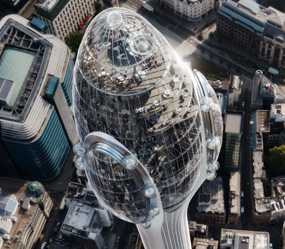
While such name-calling is good knock-about fun, the proposal is worthy of more serious consideration. Does London, let alone Central London, even need a tower like The Tulip? After all, there are already observation platforms in The Shard and the Walkie Talkie, and new ones proposed in One Undershaft and 6-8 Bishopsgate. Foster partner Grant Brooker thinks there is a substantial demand for The Tulip’s vertigo-inducing glass floors and pods: “The idea came about as a result of Open House. The queues for The Gherkin were so large they prompted Joseph Safra, the owner of the building, to ask if we could open up the space at the top to the public.” That wasn’t possible, but Fosters suggested instead that the available land on the northeast of the 30 St Mary Axe site could be used to build a slim tower to house viewing platforms, bar and restaurants. The million or so visitors it was expected to attract would make it an economic proposition.
“Plenty of cities have these marker buildings,” says Brooker. Fosters designed the Barcelona Communications Tower – the 288 metre high Torre de Collserola – in 1992. In cities like Toronto, Berlin, Tokyo and Shanghai they are popular tourist destinations, providing spectacular views of the surrounding city. Our own BT Tower does just that, but is sadly open for only limited periods. New London Architecture (NLA) hosts an annual reception in the revolving deck, which is so popular that tickets have to be distributed by ballot.

Providing new tourist infrastructure fits well with City Hall policies: in 2025, visits to the capital are expected to reach 40.4 million as long as we remain competitive and invest in culture and amenities. Those who question whether money should be spent on attractions like The Tulip when London is facing a housing crisis should realise that tourism accounts for one in seven jobs and such overseas investment benefits the wider economy. Policy E10 of the draft new London Plan says “associated employment should be strengthened by enhancing and extending (the capital’s) attractions, inclusive access, legibility, visitor experience and management….”. The Tulip responds to the Corporation of London’s own strategy to bring more people into the Square Mile to create a seven-day-week “retail, leisure and cultural destination”. The draft City Plan says “complementary land uses will be encouraged to enhance vibrancy and viability, extending to weekends to diversify the City, its economy and community”.
At the moment tourists flock across the Millennium Bridge to St Paul’s Cathedral and don’t get much further east than the One New Change shopping centre. More has to be done if the crowds are to move into the heart of the City: try and find an open coffee shop on a Saturday morning! The attraction of the Walkie Talkie’s difficult-to-access viewing gallery has increased the number of visitors somewhat in EC3, but not enough to get the shops to open. The City Plan also speaks of improving the offer at Leadenhall Market, a couple of minute’s walk from the site of The Tulip: “The character of the historic market will be maintained and enhanced as a visitor and retail destination, supporting a flexible range of retail uses.”
The Tulip’s planned exhibits and educational programme will add to visitors’ understanding of the City. As someone who spends much of his time attempting to communicate issues around development and change in London to a wider public audience, this will be a spectacular new tool. It will also enhance the Corporation’s cultural strategy, which at the moment is focused on the north-west part of the City around the Barbican Centre, the Museum of London and the proposed Centre for Music. More attention needs to be paid to the south – to the amazing heritage of the City churches, of the historic Livery Halls, the Guildhall and the riverside walk, which, in spite of being on the sunny side of the river, has a fraction of the numbers of visitors that use the South Bank.
There is some understandable concern that the popularity of The Tulip will mean that the already overcrowded City pavements will become even more so, although Brooker suggests that because of the different schedules of workers and tourists this won’t be a major problem. Anyway, if the City implements its excellent proposed Transport Strategy, which promotes improved pedestrian movement, overcrowded pavements will be less of an issue.
Norman Foster himself describes the Tulip proposal as being “in the spirit of London as a progressive, forward-thinking city”. It is in the smooth, steel and glass, engineered style we see in The Gherkin and in the work the practice does for clients like Apple, which has its roots in the high tech movement of the 1960s and ’70s. Coincidentally, the building was launched in the same week that the eponymous radical architecture group published Archigram: The Book. A key Archigram project was the Montreal Tower by Peter Cook – designed some 55 years ago – which might be seen as a precursor of The Tulip, with entertainment spaces, views and restaurants on top of a slim stalk. The aesthetic is slicker and more sophisticated but the spirit lives on.
At 305.3 metres The Tulip will be marginally higher than the proposed One Undershaft next door and shorter than the Shard’s 309.7m across the river; its bulbous, mini-gherkin pinnacle will sit comfortably above the walkie-talkies, cheesegraters, scalpels and cans of ham below. The gallimaufry of designs that make up the easter cluster can easily absorb a new friend. As the scale of the latest orthogonal towers – 22 Bishopsgate and 100 Bishopsgate – becomes apparent, it is clear that the townscape can only take a few such behemoths.
There is still a role for the sort of varied geometry that has defined the City over the past decade and has proved popular with the public. Indeed, when NLA carried out research into the number of towers being built in London a commonly heard complaint was that their views of The Gherkin were being blocked by the new developments. Among younger audiences, this was seen as just as damaging as any impact on views of St Paul’s Cathedral dome. In the build-up to the Olympics The Gherkin became a key part of brand London: gone were the beefeaters and Buckingham Place, in came images of modernity and progress.
Fosters’ latest design reflects that vision of a contemporary City, a city of culture and creativity. Is it beautiful? That is, of course, a matter of taste, but when it comes down to defining an acceptable contemporary aesthetic, I’d go with Munchetty over Scruton every time.
Peter Murray is chairman and co-founder of New London Architecture. Images from Foster & Partners.


[…] the Gherkin next door. There are hopes that it will attract more visitors to the Square Mile. Maybe one day it will, but it will first need to clear some barriers at City […]
[…] the Gherkin next door. There are hopes that it will attract more visitors to the Square Mile. Maybe one day it will, but it will first need to clear some barriers at City […]